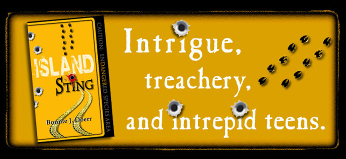
Author Bonnie J. Doerr was excited when her publisher, Leap Books, designed her book cover to match the yellow Key deer sign: Caution: Endangered Animal Area. Because her book's about a poacher, the cover artist added bullet holes, including one dripping with blood. Cool, right?
Well, maybe not.
The cover definitely has a lot of teen appeal, and Bonnie has worked up lesson plans so her book can be used in the classroom. What teachers wouldn't love to have a fast-paced eco-mystery about endangered animals that ties into the science, social studies, and language arts curriculum?
Maybe not all of them. Some, who cite teen violence, object to the cover because of the bullet holes and the blood.
So should the cover be changed to make it more palatable to teachers? Or should it stay the way it is--faithful to the contents of the book. Poaching is a bloody business, after all. Shouldn't the cover reflect reality?
Stop by my blog and leave your opinion. One commenter will win an autographed copy of the book when it comes out.
P.S. If you're wondering if the bullet holes go all the way through the book and exit through the back cover, you'll have to pick up a copy when it comes out on January 6, 2010 to see--unless you're that lucky winner.


.jpg)
4 comments:
I think it's a strong cover with genuine teen appeal - and what a bonus that it's true to the book! Sadly, too often book designers go off on a tangent that doesn't really reflect what readers will find inside the cover. I think it's a great pity that some teachers are so concerned about political correctness that they'd prefer not to look too closely or too realistically at the violence in the world we live in. I went to Bonnie Doerr's blog and looked at some of the other cover designs that were considered, and this was by far the strongest. Here's hoping Leap Books sticks with it.
Thanks for your thoughtful comments, Elaine. I hope they keep the cover too!
My only comment is that the cover's a bit busy, what with the animal and tire tracks. I'm from Texas, and it's not a stretch by any means to see bullet holes in signs of all kinds, especially in the more remote areas. But the tracks I'm not familiar with. The cover's made to look like a sign, it should stay as faithful to the form as possible. As for the bullet holes, in particular the bloody one: isn't the argument against the anti-Harry Potter crowd (due to the "promotion" of witchcraft, etc.) that if the series is getting kids to read, then we should be cool with them; in other words, whatever gets them to read, let them read. Oddly, the same crowd (in general, it seems to me) who would be upset at the violence or the bullet holes are the very ones who would want such a story (so pro-environment from your short and cool synopsis) to be read in the classroom. I vote, De-busy, but keep the rest, esp. the bloody bullet hole. So cryptic, so curious. I'll pick up the book for that alone.
You're so right, Rene.
Post a Comment